
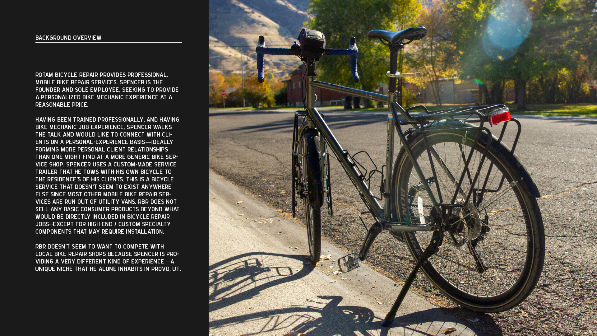
Rotam Bicycle Repair


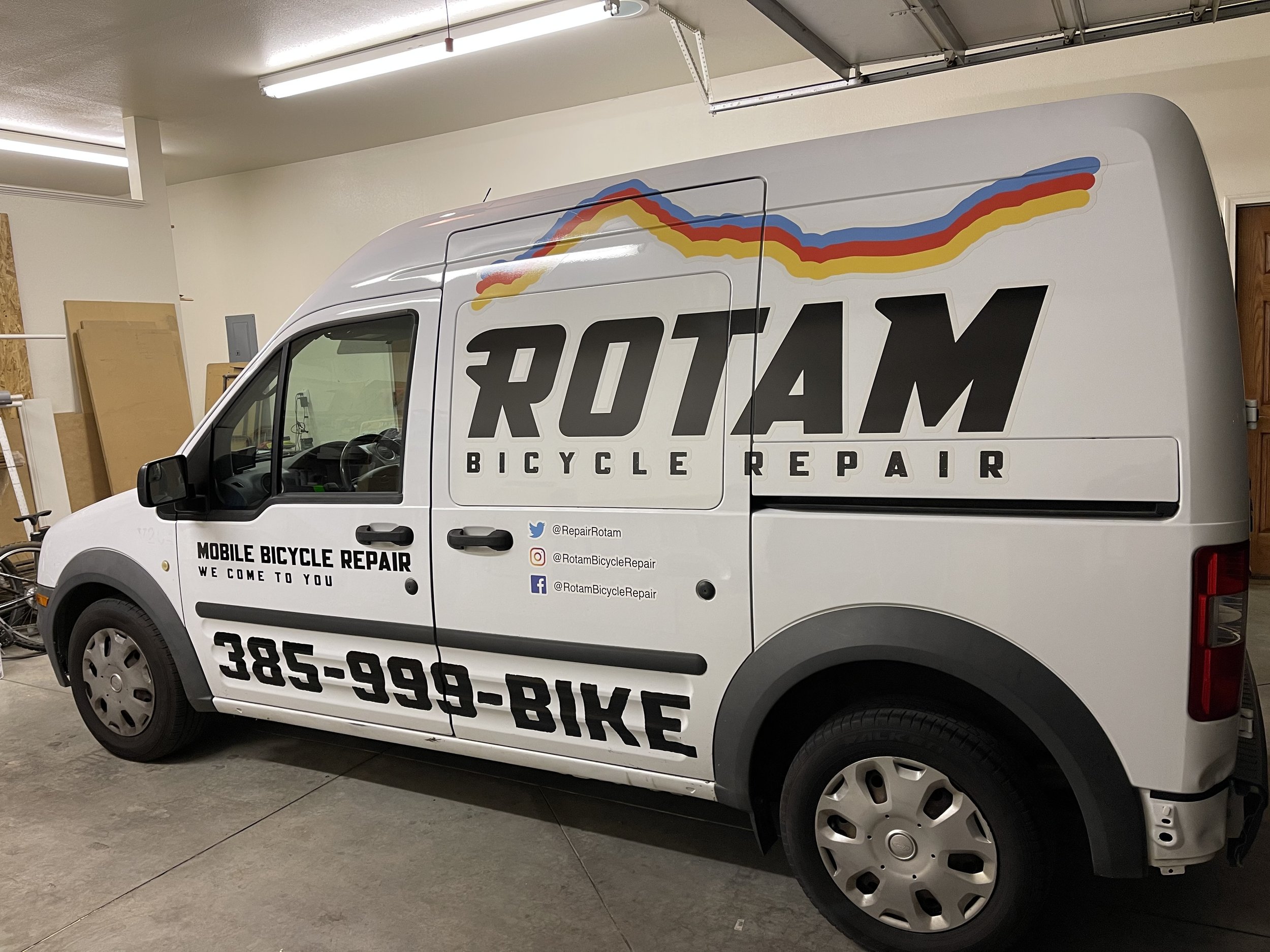
New brand identity, vinyl van wrap designs, colors, and more brand-accurate typography helped bring RBR into the 2020's with a look and feel that their customers would want on swag.
Original Logo

Research: Color & Emotional Energy (slide): Because the bicycle landscape is saturated and well establisned, research is what gave us the proper language with which to communicate with bicycle-enthusiast customers who find their bicycle knowledge to be intensely important and have already decided their favorite bicycle brands. We learned the visual language RBR's customers would be expecting, so that Rotam Bicycle Repair would fit snugly into their world and fulfill the need for on-the-go bicycle repair.
Creative Brief


Brand Design
RBR was passionate about using the Mount Timp mountain line in the logo, and using industry-familiar colors.


Typeface Base: Mesquin Italic (400) by MuSan
Additional shapes added onto the original typeface to communicate the “repair wrench” aspect of the brand without needing to display a literal wrench.
Van Wrap


Client Satisfaction
"Cozy went above and beyond to provide a branding package for Rotam that was easy to implement and effective. He was with me every step of the way from brainstorming to design to revision to interfacing with my printer to make sure my van wrap matched my vision. Honestly working with him was one of the best experiences I've had hiring someone for doing a service." — Spencer S.